< Back
Turning safer driving habits into a revenue stream for U.S. non-profit
Supporting building healthy relationship between parents and children around safe driving through introduction of gamification between them. They can create rewards based on their rules using the new product – Parent Portal.
My Role
UX/UI Designer
The team
Project Manager, 2+ Developers
User problem
Parents struggle with encouraging their children to change behaviours and drive safe
In the U.S. data shows that most accidents are caused by distracted young drivers. They often use their mobile phones and don’t focus on the road. Teenagers’ attitudes pose a threat not only to themselves but other road users too.

To let everyone feel safer on the roads, parents may collaborate with their children based on rules and rewards system.
Business problem
A non-profit organisation monetises the idea
The data published in the U.S. sparked an idea to build a new product as an answer for this need and start making profit. The company can support parents in building healthy relationships with their children around safe driving through the introduction of gamification between them.

Parents can create rewards based on their rules using the new product – Parent Portal.
Process
Building rewards concept based on gathered data
To launch MVP, we used an already existing feature from TASL (This App Saves Lives – product of non-profit organisation) which was analysing drivers’ speed in real time and giving points for the right behaviours. For Parent Portal purposes, we modified it and added a distance control to later calculate the percentage of the distance that was driven in a safe manner.

Using the way we collect data in the existing product helped us move forward with the MVP version of the new one.
Organised the flow to connect a new product with an existing one
This App Saves Lives used to work with different sectors and its website was a base for all users. Hence, we decided to add one more tab and promote the new upcoming product.
Design decisions
Decided to go with option C to display key statistics for parents
✅ Display a summary of the main metrics necessary for achieving goals.
✅ Present metrics history for the last 7 days.
✅ Easily navigate through different time periods.
✅ Present all data within a single height of a mobile screen to facilitate easy switching between data.
✅ Indicate that all actions are associated with metric history through a solid background.
Option B won in data organisation
The mobile first approach is tricky sometimes. At first, the desktop version of a dashboard was confusing and the hierarchy was messy. Once I decided what could be hidden or visible. I reorganised it to make the information more understandable.
Learnings
Changing tools pays off, even if the start is rough
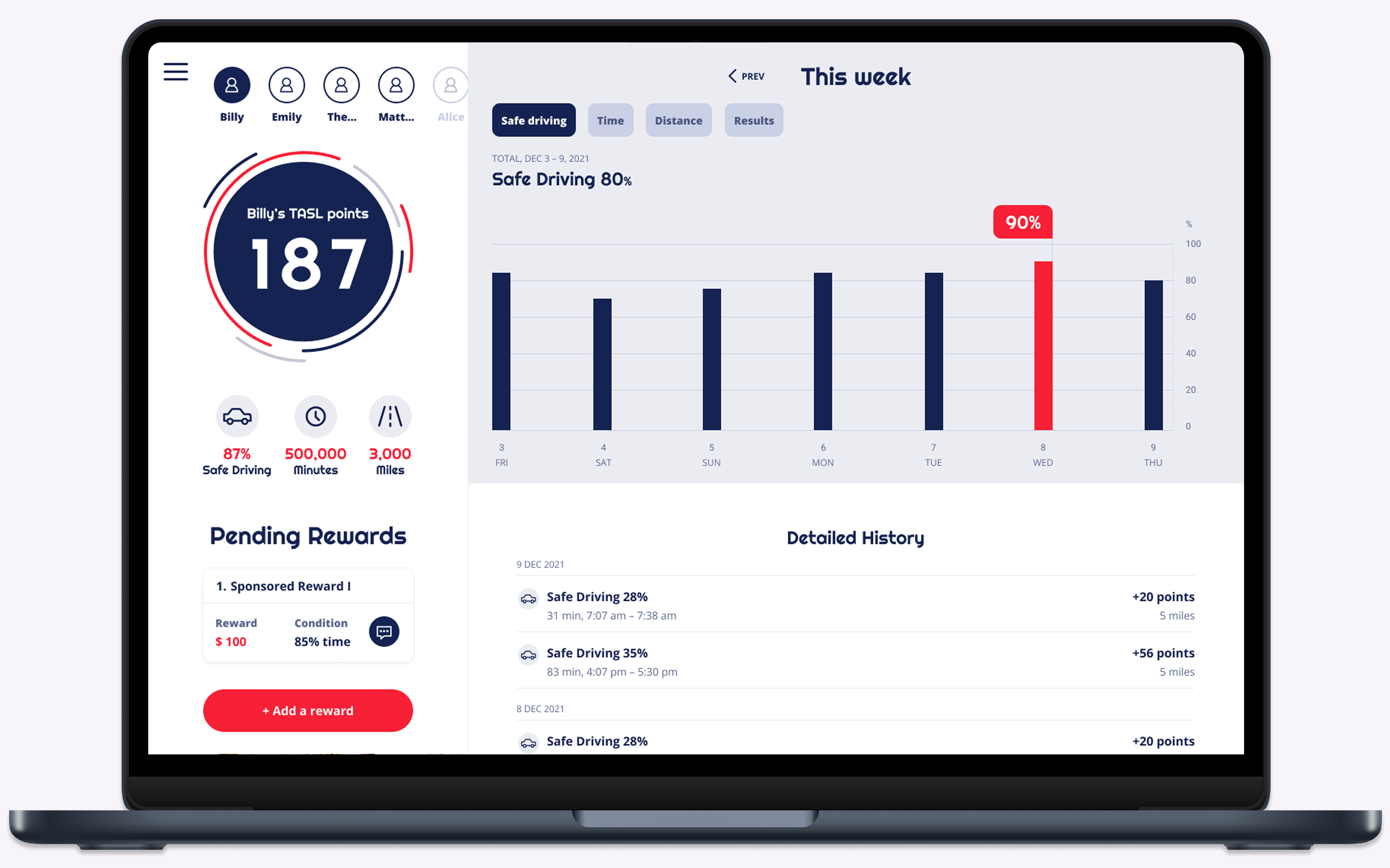
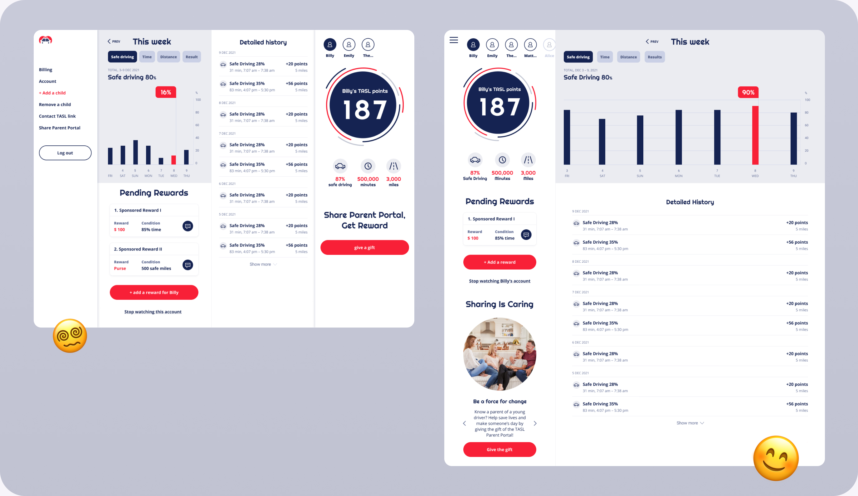
This App Saves Lives was created in 2015, at that time designers used to work in Photoshop so when I wanted to work in Figma and keep the brand consistent it was challenging. I knew that working in the newer tool would speed up the process for developers and pay off in the future, as we wanted to evolve the product later, so I jumped into Photoshop, measured the elements to create a new design system in Figma with consistent branding.

Changing the tool not only accelerated the implementation phase but also our cooperation with the stakeholders during consultations.
Sometimes good design practices are the only method
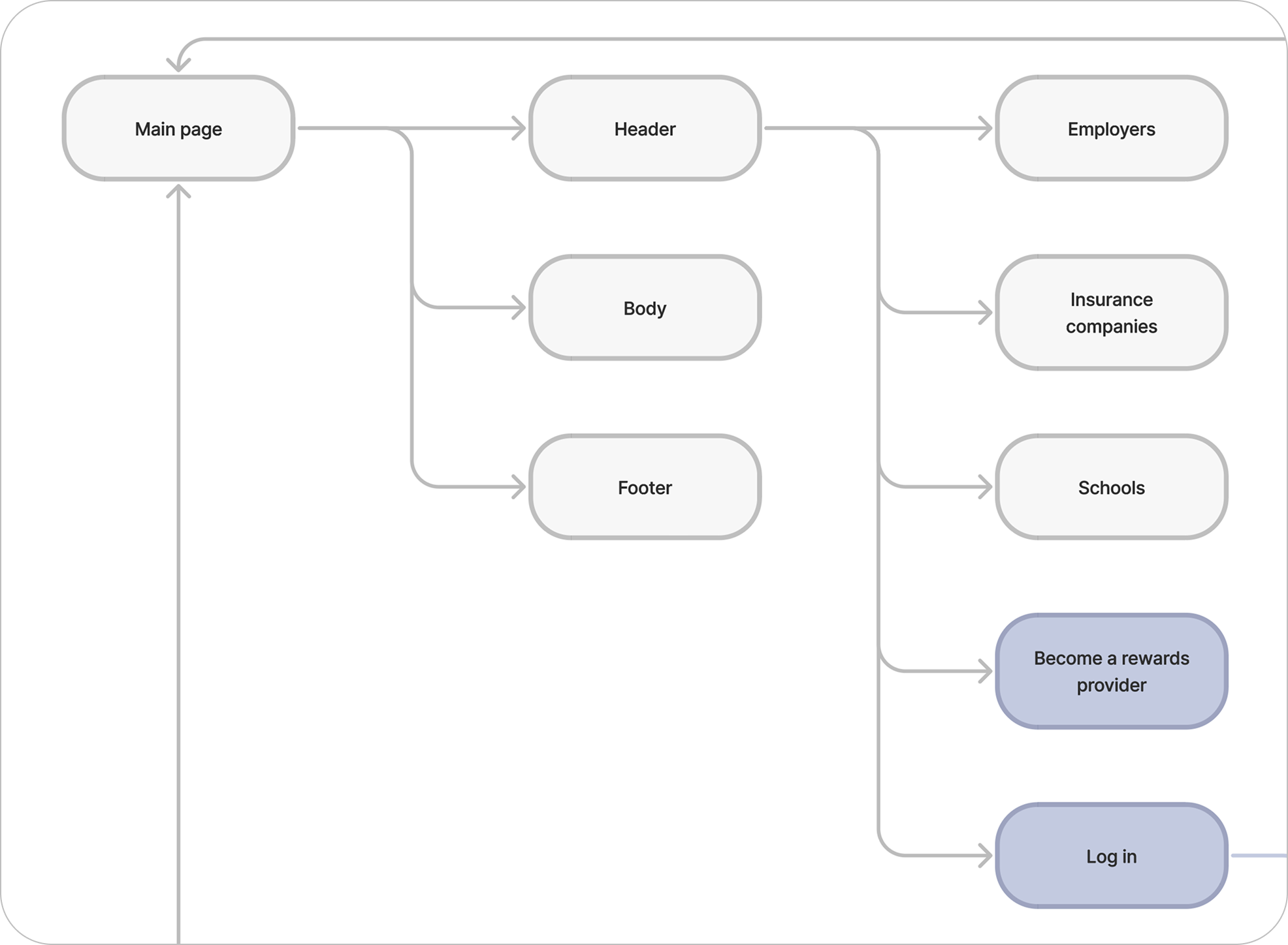
Building a new platform without testing it is difficult but with a tight budget and time pressures, as it is very common for startups, I had to follow best design practices and a few consultations with our head of design in the company.
I found out that
I cannot follow the journey any more
In early 2024, Founder Ryan Frankel announced in an interview for technical.ly that the TASL had to be closed down due to financial hardship. Nevertheless, it was a thoughtful journey and true pleasure working alongside a man full of passion for his work. More details are available on the technical.ly website.