< Back
Traffic hazards control app with civil authority release for public safety
Supporting building healthy relationship between parents and children around safe driving through introduction of gamification between them. They can create rewards based on their rules using the new product – Parent Portal.
My Role
UI Designer
The team
Project Manager, 2 Developers, 2 Designers
Emergency message
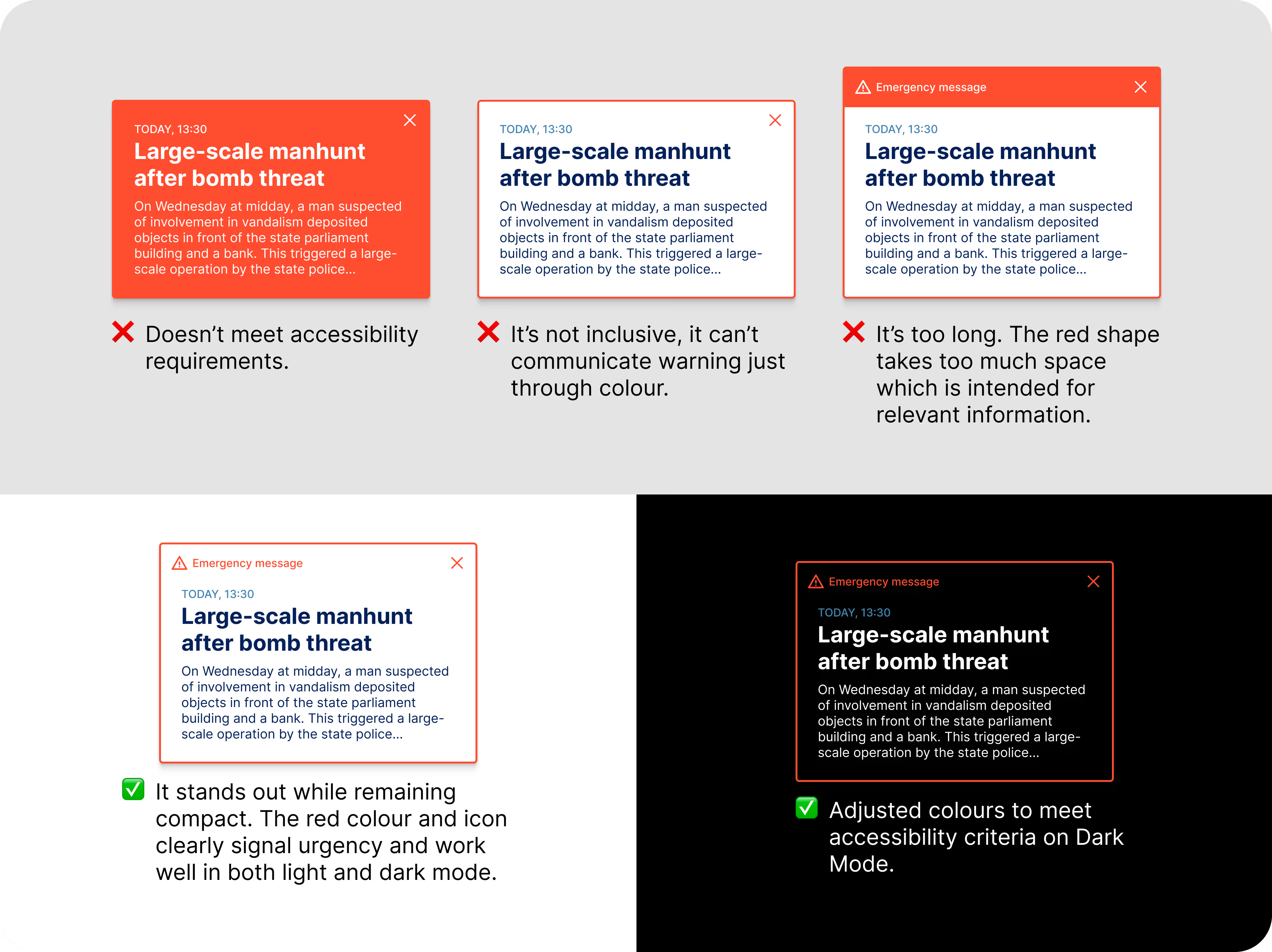
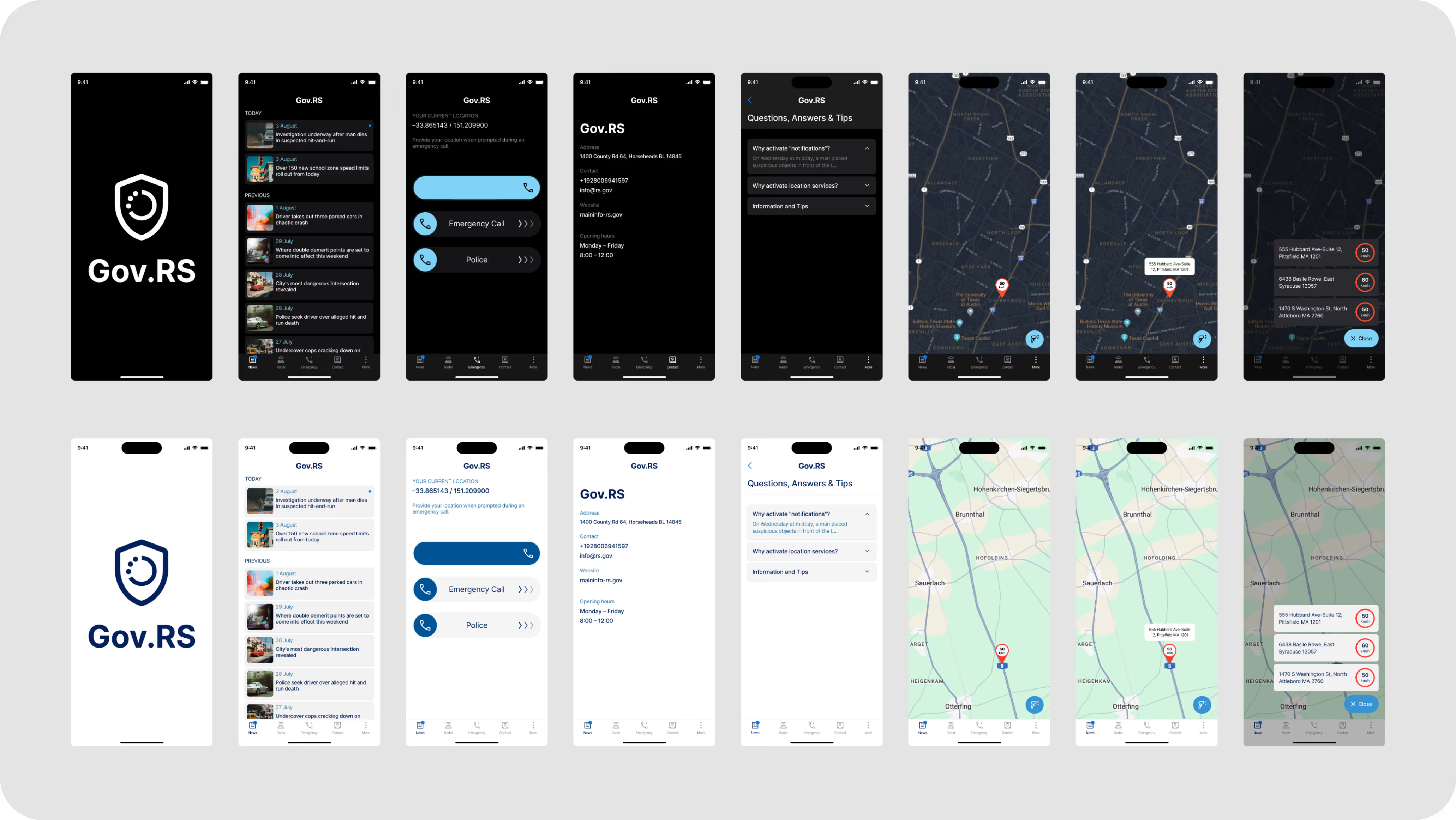
Emergency message design finally defined by dark mode
I went through four iterations of this message. Each version looked good visually, but some didn’t meet the required design patterns or accessibility standards. This project showed me how important it is to test colours in both light and dark modes. A colour that works perfectly in light mode can lead to the opposite effect in dark mode.
Tab bar
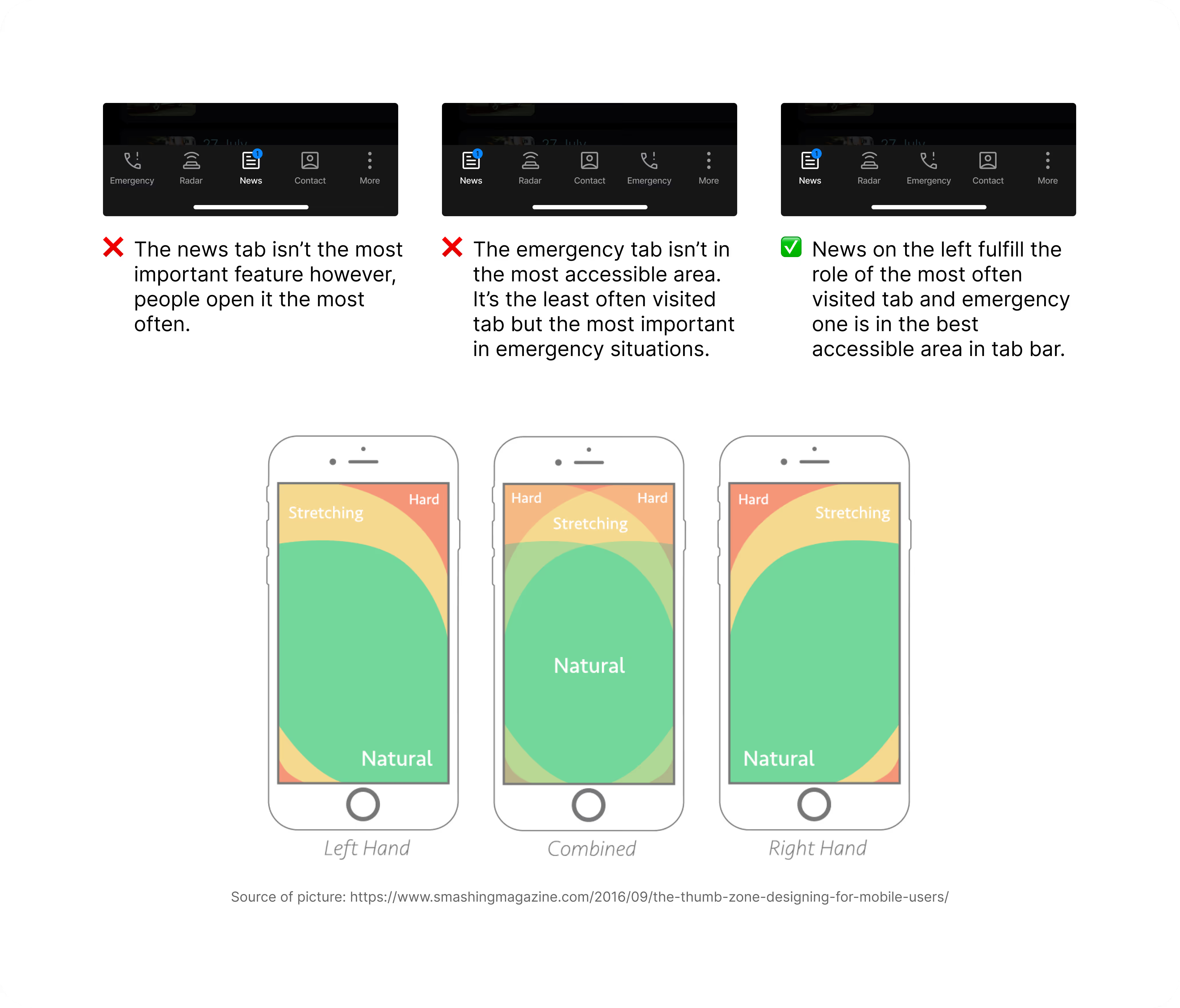
Tab bar was designed to meet people behaviours in the app
Order of tabs was defined by accessibility standards and frequency of use.
slide to call
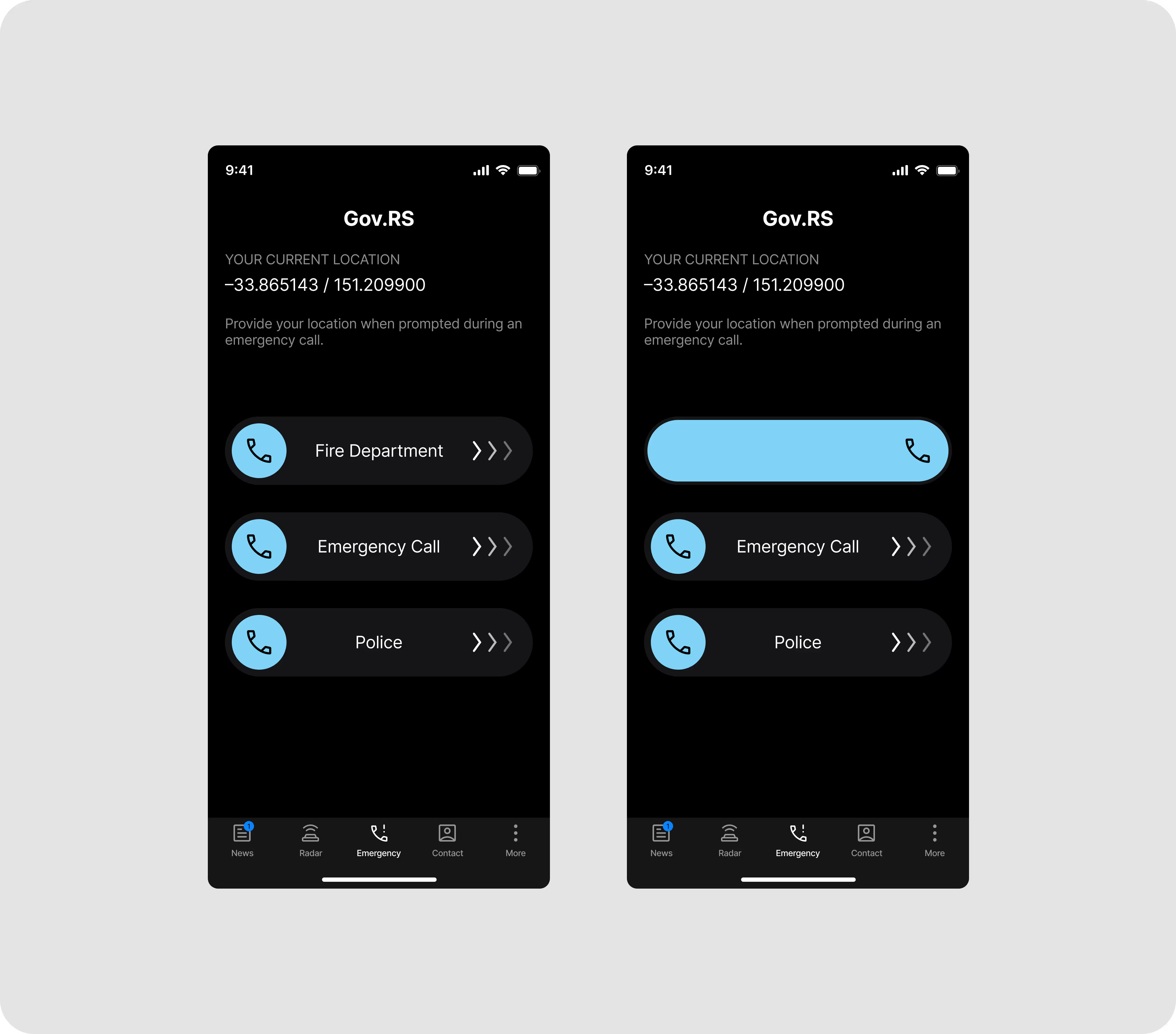
A sliding interaction that prevents accidental calls
Many users struggled with accidentally calling their contacts. The sliding interaction was designed to prevent these mistakes and ensure the line remains free for people who genuinely need help.
ios vs android
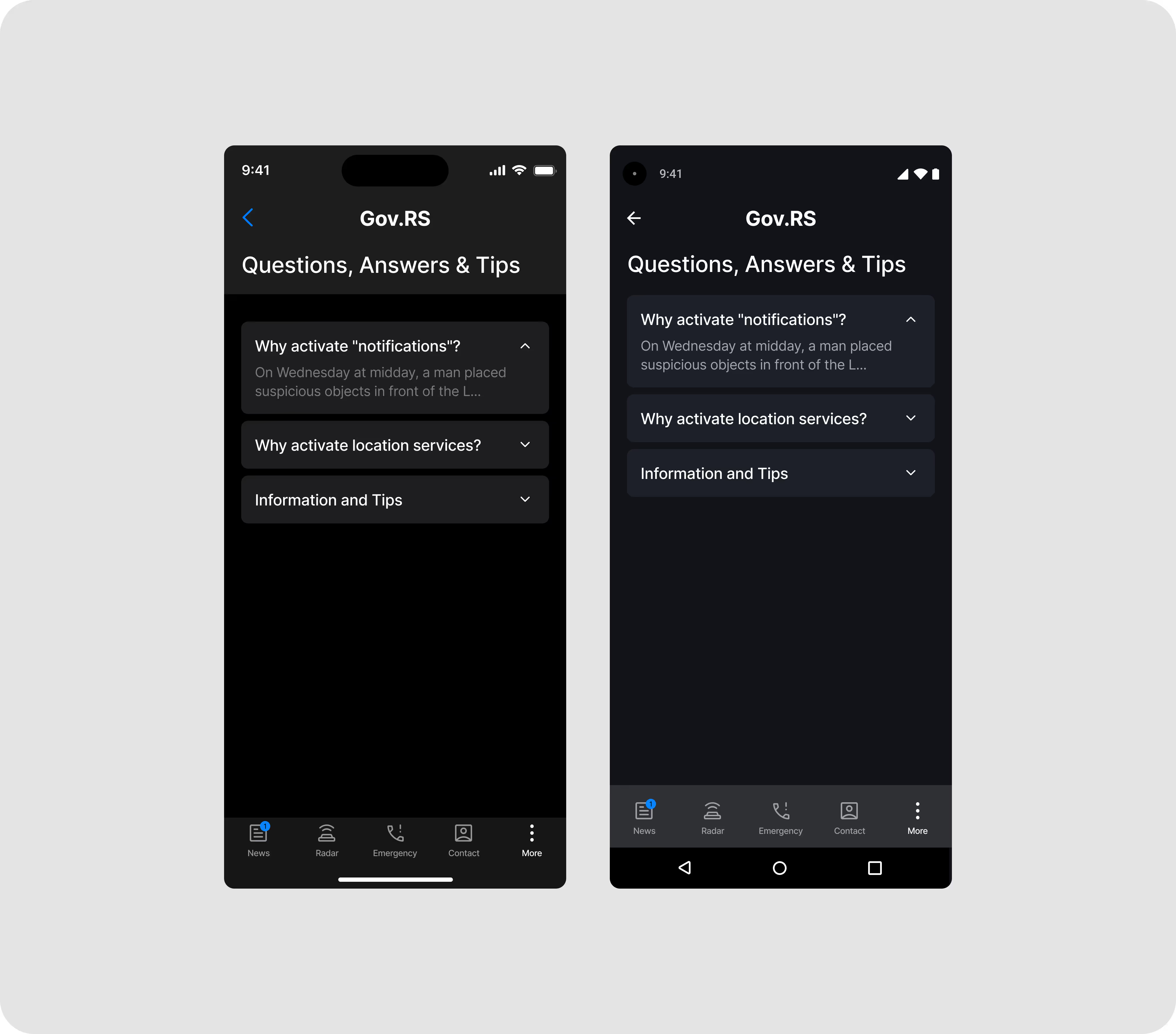
Design the app for two different operating systems
The main differences between the Android and iOS versions of this app were dark mode and navigation. I adjusted contrast ratios to meet accessibility standards and designed the navigation in line with each system’s recommended design practices.
I found out
Why testing dark mode in dark environments matters
Colours and contrast behave very differently in low-light environments. Some shades that appear dark enough during the day can look completely different in real darkness, so testing in true dark conditions is essential for maintaining legibility, comfort and accessibility.